


Your guide to PLG Pricing Pages
Your guide to PLG Pricing Pages
👋 Hi and welcome to PLG Monetized newsletter. Every week we explore how leading SaaS companies leverage monetization to drive growth through self-serve sales.

Let’s start with the basics...
By definition, every PLG company has to have a public pricing page. This is because “PLG” means that customer can do a self-serve checkout and therefore, customer needs to know what they are buying and how much it will cost.
There are two types of PLG companies. “Pure PLG” - everything is done through self-serve and “Hybrid PLG” - companies that have both self-serve and sales assisted sales. Then of course, there are non-PLG companies (booooo) that only have a sales option available.
Ultimately, the main purpose of a pricing page is to help you convert site visitors to take the next step - either enter a self-serve funnel or get in touch with sales.
These pages are hosted on he marketing page, where site visitors can view them without having to create an account or without having to log in.
Example - Typeform
Typeform is a “Hybrid PLG” company. It supports self-serve and a sales motion.
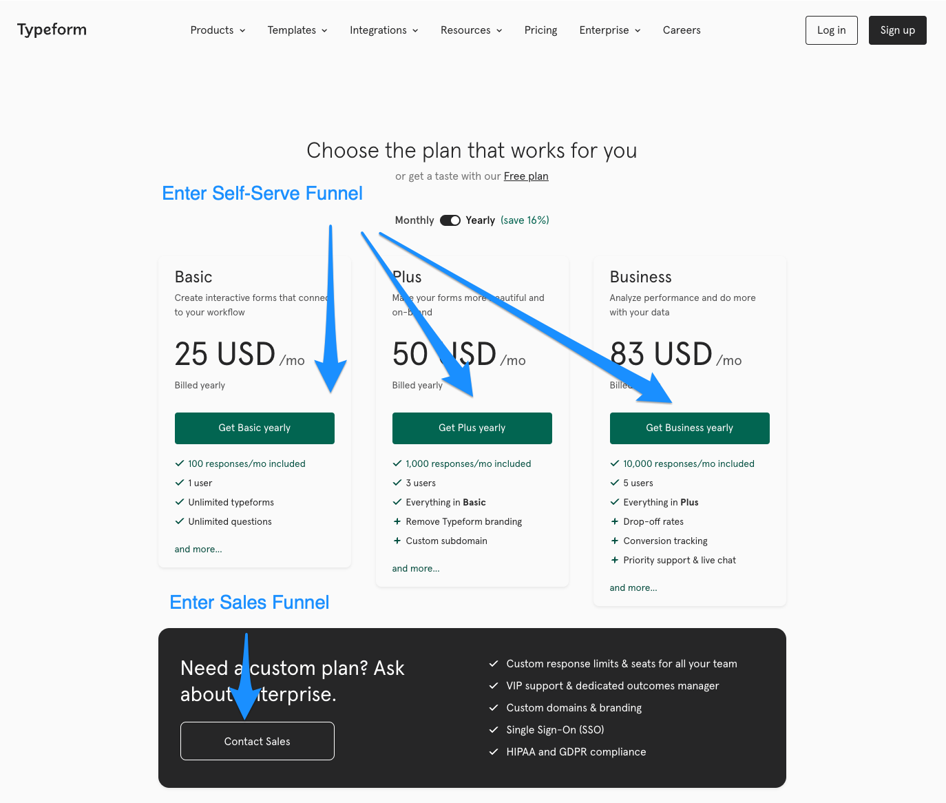
On their pricing page, Typeform has two entry points - one for self-serve users, the other for people who wish to speak to sales.
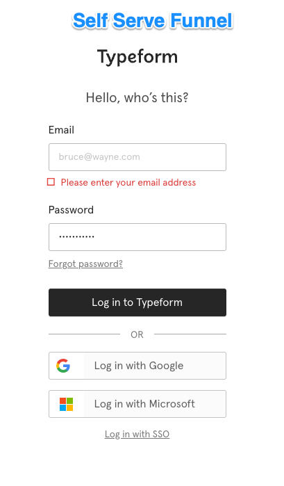
Self-serve takes you to an account creation page:
And the “Contact Sales” CTA takes you to … a Typeform :)
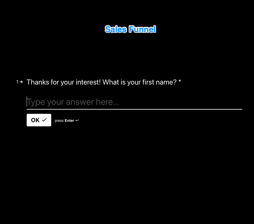
The Typeform is used to collect information to qualify the prospect and route them to the proper sales rep in the right priority order.
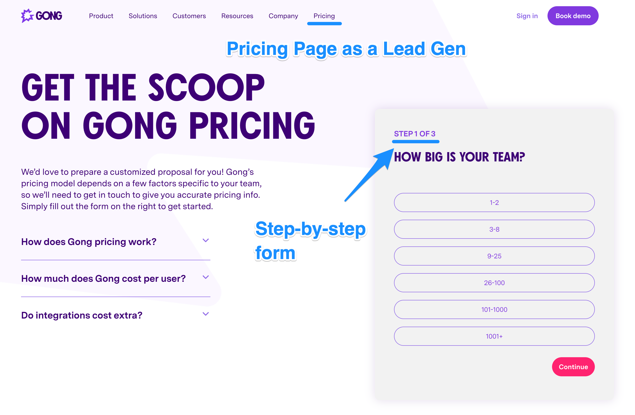
Example 2 - Gong
Here’s another example - Gong. They use their Pricing Page as a lead-gen form. Not PLG (booooo), but I think they are one of the best ones that I’ve seen, so let’s take a quick peek:
Step-by-step form makes it less jarring than a boring old form with lots of fields
They start with an easy question (How big is your team)
The FAQs and copy are a nice touch as well
Getting it Right…
When designing pricing pages - think about it as a conversion optimization exercise (opposed to a features or a product demo page).
Keep in mind that the website pricing page is about getting the user to take the next step - either start a trial/freemium or get in touch with sales.
Note that sometimes users will reference the pricing page to compare plans before making the purchase or when thinking about upgrading. This however is a secondary use case (as that information should be contextual as part of in-product checkout flow), so it should not be the primary focus.
Best practices:
Keep it simple: mention a couple of key features or benefits per plan. Do not list every single feature under the sun. If you feel compelled to do so (e.g. for SEO or for support purposes), do it in a separate section below the fold or make it collapsable.
Address objections: add an FAQ and/or copy to address common objections to move the user through this part of the funnel. This includes questions about billing frequency, trial duration, currency, etc.
Speak to buyer personas: oftentimes your visitors will use the pricing page to determine if this product is for them. Add copy such as “Best for individual designers or best for 5-10 person design teams” to address this question.
Clean CTAs: what do you want the user to do next? Start a trial, book a demo, book a meeting - make it clear.
Example - Codecademy
Codecademy has gotten a lot of things right on their pricing page:
Clean design - keeping the top section very succinct (they don’t even list features - they list benefits in their top 3 cards)
Objection handling - can I afford this, do I pay monthly, can I trust it, etc.
Finally, a clean set of CTAs - with the most prominent one being “Try Pro for free”
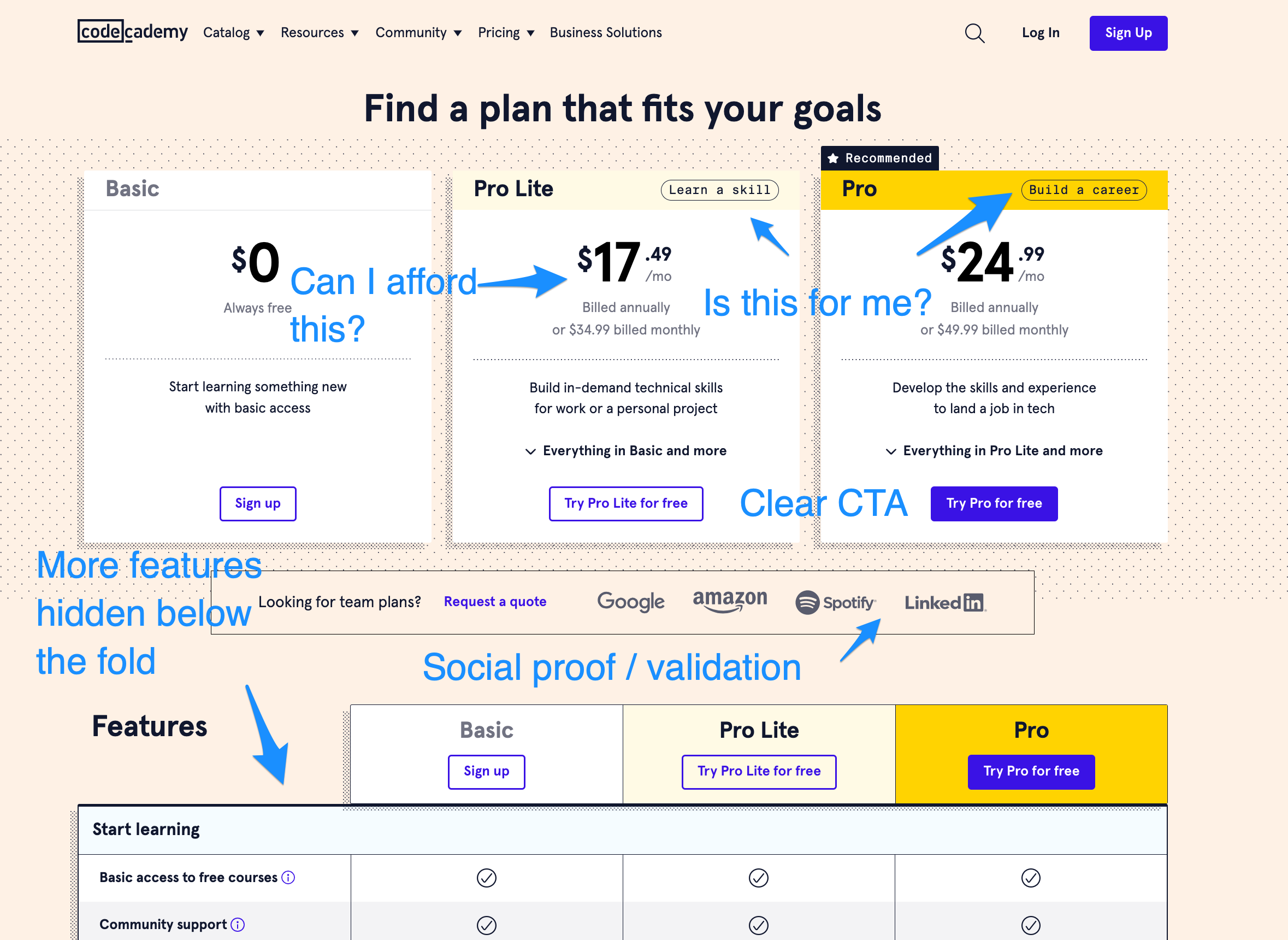
The page is primarily optimized for CTA button clicks. It contains all the right information to help visitors make that decision without overwhelming them with too much detail.
Example - SquareSpace
SquareSpace recently updated their pricing page. They used to have one big table view (with all the features), but you can see below that they have now simplified it and moved it to a collapsible section hidden behind “Compare Plans”.
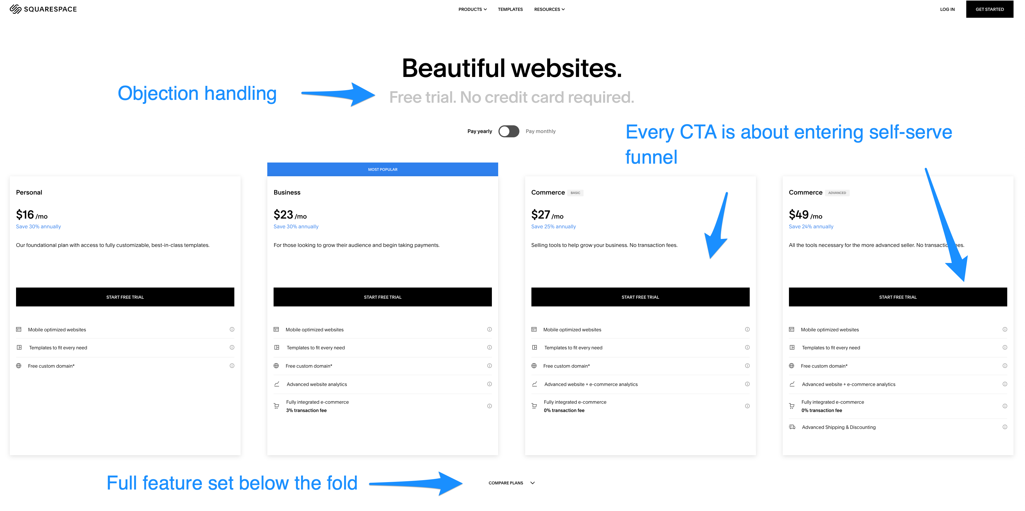
The benefit of having a feature comparison table is that it can bring in additional SEO traffic and it becomes a point of reference for customers when chatting with support, but this is a secondary use case. Pricing pages that live on the marketing site should be optimized for CTA conversions - that’s their primary purpose.
Summary
The main purpose of pricing pages is to get site visitors to take the next step in their buyer journey - enter self-serve or book a demo / get in touch with sales
Optimize pricing pages for conversions (CTA clicks) by addressing common questions while avoiding cognitive overload
Ensure pricing pages speak to your buyer personas - if you sell to students or small creative agencies, this is the perfect place to state it
Additional Resources
Check out PricingSaaS.com where you can find a over 2000 pricing pages examples
Want a free audit of your pricing page? We offer it as a service at Buyerson Inc. - get in touch.
We love connecting with people in the industry to generate interesting content - if you are up for a podcast or an interview, just connect with me on LinkedIn